GeminiQ
Design System
Building IQVIA's enterprise design system from the ground up unifying 8+ product teams under a single token-driven component library and scaling internal adoption from 15% to 63%.
15→63%
Internal client adoption
50+
Components in 1 month
3
Products shipped faster
2
Major contracts won
Overview
The problem worth solving
IQVIA's product portfolio had grown rapidly through acquisition and parallel development resulting in a fragmented ecosystem of 8+ products, each with its own component library, design language, and interaction patterns. Designers were rebuilding the same buttons, modals, and form patterns from scratch on every project. Engineers were implementing the same components with subtle behavioral differences across products. And buyers were navigating a suite of tools that felt like they came from different companies.
The cost was measurable: 30–40% of design time was spent rebuilding foundational UI rather than solving product problems. New product launches were delayed by weeks of ramp-up time. And cross-product consistency a key differentiator in enterprise healthcare technology was essentially absent.
The mandate was clear: build a unified design system GeminiQ that could serve as the single source of truth for all of IQVIA's product surfaces, from web applications to Salesforce-based enterprise tools, and drive genuine adoption across the organization.
Key Contributions
- Scaled GeminiQ adoption from 15% to 63% of internal clients through enablement, governance, and contribution frameworks
- Designed and delivered a 50+ component Framer X library built from code in one month, saving UX and product teams months of duplicated effort
- Built a three-tier design token architecture (global → alias → component) enabling product-wide theming and future rebranding at scale
- Extended GeminiQ into a Salesforce Lightning Web Component library delivered to 3 product teams, directly contributing to 2 major enterprise contract wins
- Established Design System governance including a DS Committee, contribution pipeline, and cross-team office-hours program
- Accelerated the completion of 3 prioritized products by eliminating foundational UI rework from every team's sprint cycle
Role
Design Systems Lead
Company
IQVIA
Timeline
2019
Surfaces
Web, Desktop, Salesforce LWC
Team
Cross-functional Design,
Engineering, PM
Tools
Framer X, Figma, Salesforce LWC, Storybook
Components
50+ (atoms → organisms)
Token Architecture
Global Tokens
The raw primitives every color value, spacing step, type size, and elevation level available in the system. Brand-owned, rarely referenced directly by components.
Alias Tokens
Semantic mappings that give meaning to globals connecting brand decisions to purpose. These are what designers and engineers work with daily.
Component Tokens
Component-scoped overrides that consume alias tokens. Allows individual components to be themed without breaking the broader system.
Token names follow BEM syntax (Block__Element--Modifier) pairing with Atomic Design's component hierarchy for a consistent, predictable naming language across design and code


Cross-functional alignment workshop mapping component ownership across product teams
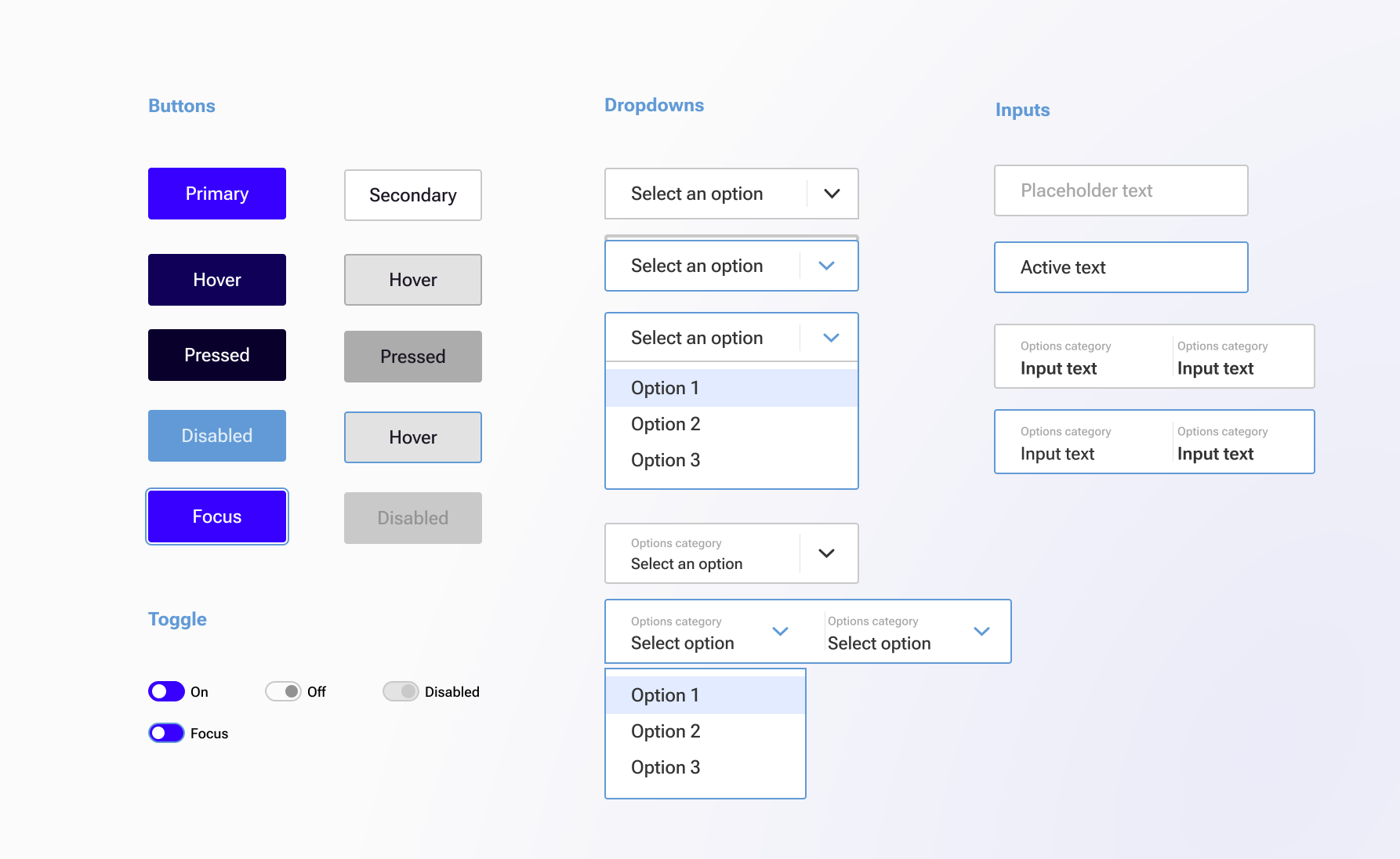
GeminiQ component library 50+ code-backed components built over one month
Component Structure
Built on Atomic Design
GeminiQ's component library was structured around Brad Frost's Atomic Design methodology a mental model that mirrors how interfaces are naturally composed. Starting from the smallest indivisible UI pieces and composing upward, Atomic Design gave the team a shared vocabulary for discussing, building, and documenting every layer of the system.
This hierarchy maps directly to BEM token naming a button atom consumes button__bg--primary, a form molecule composes atoms and references input__border--focus, and an organism like a data table inherits from both creating a consistent, traceable thread from token to finished UI.
Atoms
The smallest building blocks indivisible UI elements
Molecules
Purposeful combinations of atoms that form simple UI units
Organisms
Complex, reusable UI sections composed from molecules and atoms
Templates
Page-level layouts that arrange organisms into scaffolds
Design Process
How we built it
Audit & Discovery
Conducted a full audit of IQVIA's product portfolio cataloguing UI inconsistencies, duplicated components, and divergent pattern libraries across 8+ product teams. Ran stakeholder interviews with product managers, engineers, and designers to map the pain points: teams were reinventing the same components repeatedly, each with slightly different behaviors and visual specs. Quantified the waste: on average, individual teams were spending 30–40% of design time rebuilding foundational UI rather than solving product problems.
Foundation & Token Architecture
Designed the GeminiQ token system from first principles color, typography, spacing, elevation, motion, and border radius built to scale across IQVIA's web, desktop, and Salesforce product surfaces. Established a three-tier token architecture (global → alias → component) to decouple brand decisions from component implementation. This meant a global rebrand or theme change could be executed in hours, not weeks. Aligned the token naming conventions with IQVIA's engineering standards to ensure seamless handoff.
Component Library Build
Structured the GeminiQ component library around Atomic Design methodology progressing from atoms (buttons, inputs, icons, badges) through molecules (form fields, search bars, card headers) to organisms (data tables, navigation shells, modal dialogs) and templates (page layouts, dashboard scaffolds). Led a team sprint to design and code the full library in Framer X 50+ production-ready components over one month, each built from code rather than static design files. Token names followed BEM syntax (Block__Element--Modifier), ensuring a predictable, consistent naming language shared between design and engineering. Delivered full documentation covering anatomy, usage guidelines, accessibility requirements, and implementation notes for every component.
Salesforce Lightning Extension
Created a winning methodology to extend the GeminiQ system into a Salesforce Lightning Web Component library solving one of IQVIA's most complex cross-surface consistency challenges. Mapped GeminiQ's token system to Salesforce's SLDS design tokens, built a bridge layer of custom LWC components that honoured GeminiQ's visual language while respecting Salesforce's technical constraints. Delivered the library to 3 product teams. The resulting products won 2 major enterprise contracts, with buyers citing UI consistency and polish as key differentiators.
Adoption & Governance
Built adoption through a combination of enablement, visibility, and governance. Ran hands-on workshops to onboard product teams, created contribution guidelines so teams could propose new components, and established a design system office-hours cadence to remove blockers in real time. Paired adoption tracking with qualitative feedback loops measuring adoption rate (15% → 63% of internal clients) alongside time-to-ship improvements across each onboarded team. Established a Design System Committee with rotating PM and engineering representation to sustain the system post-launch.
Key Design Decisions
What we chose and why
Build from code, not Figma statics
Before
Previous design tools at IQVIA produced static mockups that diverged from implementation. Engineers rebuilt components with subtle behavioral differences that compounded over time into inconsistency.
After
Every GeminiQ component was built in code first (Framer X), then wrapped in Figma design specs. This meant the design library and engineering library were always in sync eliminating the gap between design intent and shipped product.
Three-tier tokens over flat variables
Before
A flat variable approach (e.g., $blue-500 used directly in components) meant any brand update required hunting down every usage across every component a fragile, time-consuming process.
After
A three-tier token hierarchy (global → alias → component) meant brand changes propagated automatically. Theming a product for a white-label client went from weeks of manual work to hours of token overrides.
Adoption through enablement, not mandate
Before
Past attempts to standardize UI at IQVIA relied on top-down directives teams were told to use shared libraries without training or buy-in. Adoption plateaued at 15% and stalled.
After
GeminiQ launched with hands-on onboarding workshops, office-hours, contribution guidelines, and a Design System Committee with team representation. Adoption grew organically from 15% to 63% because teams had agency and support, not just instructions.
Salesforce Extension
Taking GeminiQ into Salesforce and winning contracts
IQVIA's enterprise clients operated heavily inside Salesforce. Extending GeminiQ to cover Salesforce Lightning Web Components wasn't just a technical challenge it was a business opportunity.
I developed a systematic methodology to bridge GeminiQ's design token layer with Salesforce's SLDS token system, building a custom LWC component library that preserved GeminiQ's visual language while fully respecting Salesforce's technical constraints.
The library was delivered to 3 product teams. The resulting products consistent, polished, and visually coherent across Salesforce and web won 2 major enterprise contracts, with decision-makers citing interface quality and consistency as key differentiators.

Outcomes
Results across the organization
15% → 63%
Adoption growth
Internal client adoption grew from 15% to 63% against a 70% roadmap goal driven by enablement, hands-on onboarding, and a contribution model that gave teams ownership rather than just a mandate.
50+
Components in 1 month
A 50+ component Framer X library built from code over one month saving UX and product teams months of duplicated foundational work across the design and engineering cycle.
3 products
Accelerated to ship
Three prioritized products crossed the finish line faster freed from the overhead of rebuilding foundational UI, teams redirected sprint capacity toward differentiated product work.
2 contracts
Won through design
Two major enterprise contracts won with buyers directly citing the consistency and polish of IQVIA's Salesforce-integrated product suite as a decision-making factor.
Reflection
What I learned
The most important thing GeminiQ taught me is that a design system is a product, not a project. It needs a roadmap, a team, a governance model, and most importantly customers who feel invested in its success. The teams that adopted GeminiQ fastest were the ones who felt like contributors, not consumers.
Building the component library from code rather than static Figma files was a forcing function for quality. When the design library and the engineering implementation are the same artifact, the gap between design intent and shipped product collapses. It also changed how engineers engaged with the system they trusted it, because they could see it was real.
The Salesforce extension was where the system's architecture was truly stress-tested. The three-tier token model made the LWC bridge possible without it, mapping GeminiQ's visual language to Salesforce's constraints would have been a manual, brittle effort. Investing in the right token architecture at the start paid off in a way I hadn't fully anticipated.
Terance is a hybrid, a true living unicorn that is very very rare to find. At IQVIA, he and his team designed a Framer X library from code and completed about 70 components in two weeks. This saved the UX and product teams a lot of time and escalated the completion of 3 prioritized products. He also created a winning methodology to build a Salesforce lightning web component library and delivered it to 3 product teams that won us 2 major contracts.
Vince Kodikal
Product Design Specialist, Boeing Space Intelligence and Weapons · formerly IQVIA
Explore more work
See all projects