Azure Static
Web Apps
Transforming the onboarding and dashboard experience for Microsoft's cloud hosting platform cutting time-to-value and driving deeper feature adoption across a global developer audience.
−25%
Onboarding time
+30%
Service adoption
12
User interviews
3
Design sprints
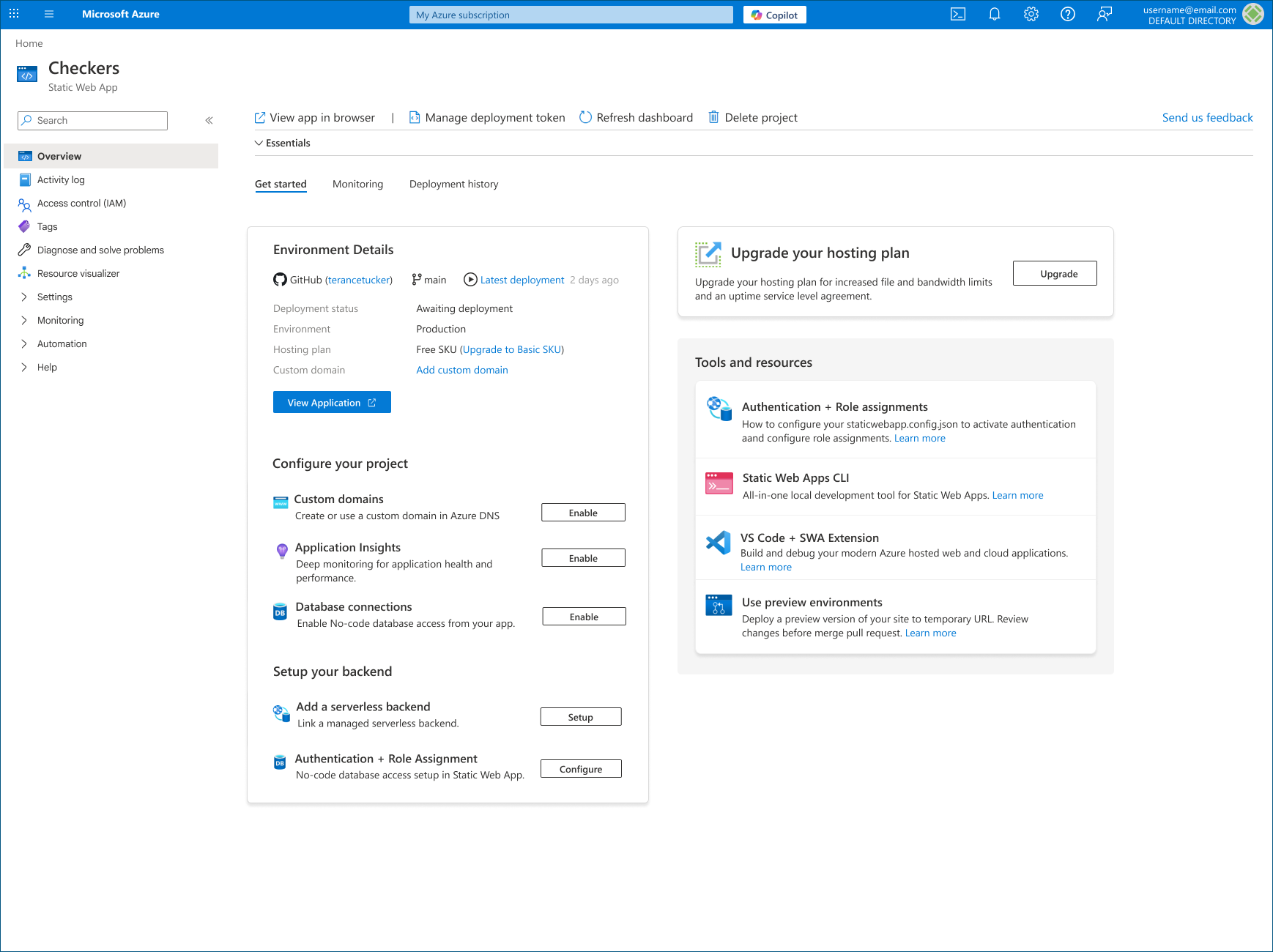
Overview
The problem worth solving
Azure Static Web Apps launched as a powerful platform for deploying modern web applications but adoption data told a troubling story. Developers who signed up weren't making it through onboarding, and those who did often failed to discover the integrated services bundled with the product.
The root cause wasn't capability. Azure Static Web Apps had best-in-class features: built-in authentication, serverless APIs, custom domains, staging environments. The problem was discoverability and context. The UI presented a flat list of features with no narrative connecting them to a developer's actual workflow.
My mandate: redesign the first-run experience and dashboard to reduce onboarding friction and drive adoption of the full feature surface without adding complexity.
Role
Lead UX Designer
Team
2 PMs, 6 Engineers,
1 Developer Advocate
Timeline
8 months (2023–2024)
Platform
Azure Portal (Web)
Tools
Figma, Maze, Azure DevOps, Clarity
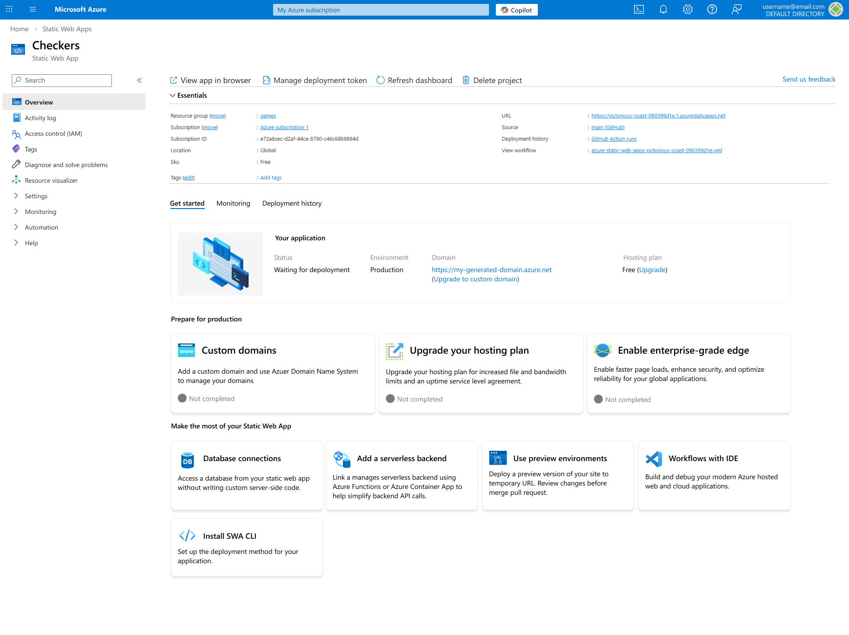
Static Web Apps dashboard v1
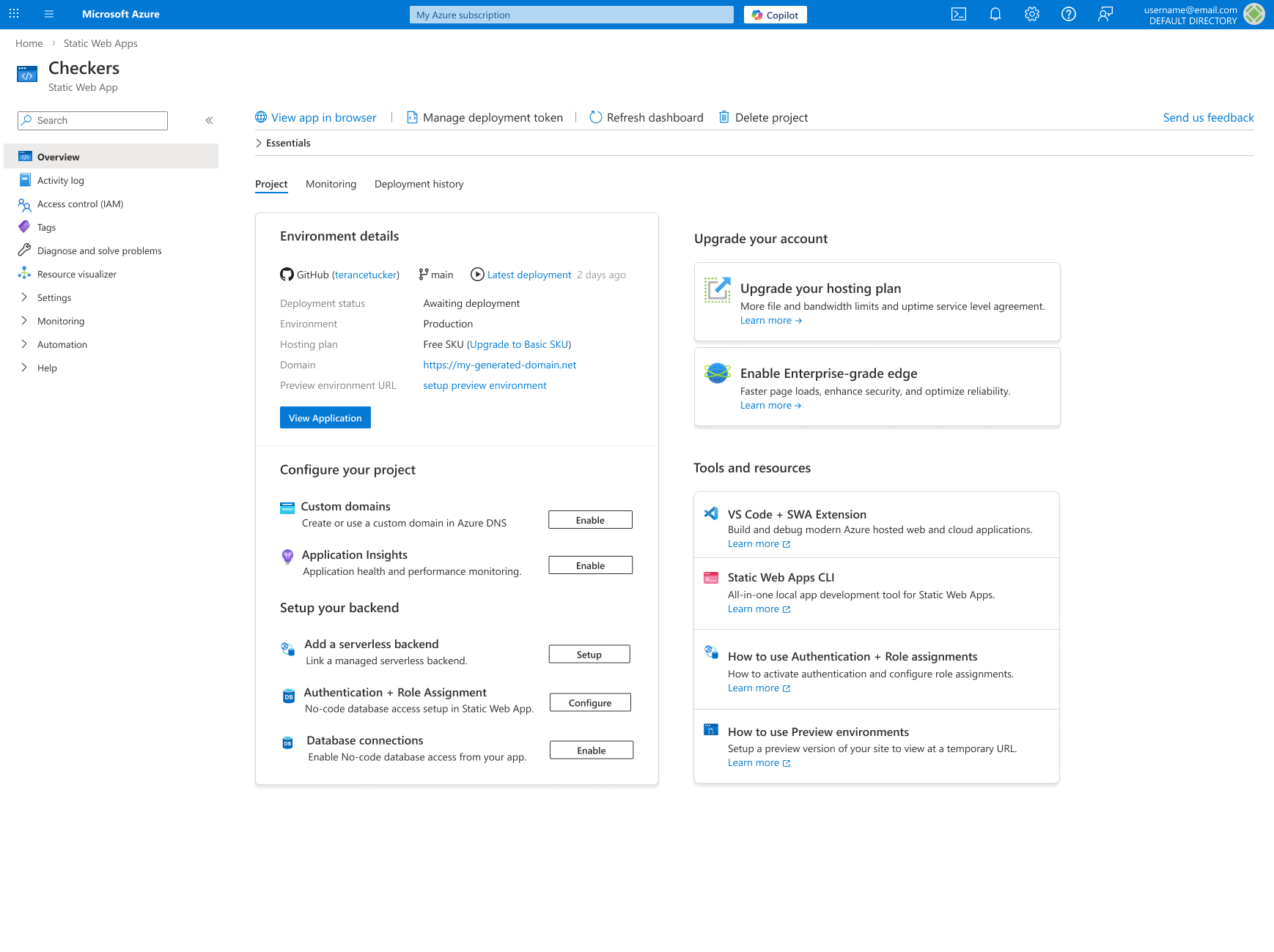
Static Web Apps dashboard final version.
Design Process
How we got there
Discovery & Research
Conducted 12 in-depth user interviews with cloud developers and DevOps engineers across enterprise and startup segments. Ran a survey with 200+ Azure portal users to quantify pain points. Mapped the existing onboarding journey end-to-end and identified 7 critical drop-off points.
Synthesis & Framing
Clustered interview findings into affinity diagrams to surface core themes. The dominant insight: developers couldn't connect the dots between Azure Static Web Apps features and their own deployment workflows the UI presented capabilities in isolation rather than as an integrated story.
Ideation & Concept
Ran three cross-functional design sprints with engineering, PM, and developer advocates. Explored three distinct onboarding paradigms: wizard-driven, contextual, and goal-first. Converged on a goal-first approach surfacing the user's deployment target on day one and scaffolding the experience around it.
Prototyping & Testing
Built mid-fidelity prototypes in Figma and ran two rounds of unmoderated usability testing (n=24 per round). Iterated on the dashboard IA, onboarding checklist design, and in-product contextual help patterns. Time-on-task dropped 38% between round one and round two.
Delivery & Measurement
Partnered with engineering to ship in a phased rollout new users first, then existing. Defined success metrics pre-launch and tracked via telemetry: onboarding completion rates, feature adoption funnels, and support ticket volume. Results exceeded targets within 60 days.
Key Design Decisions
What we changed and why
Goal-first onboarding
Before
A generic 5-step wizard that walked every user through the same setup regardless of their goal.
After
A goal-selection screen at step 0 users declare their deployment target and the onboarding flow adapts. Drop-off fell 42%.
Contextual feature reveal
Before
All features listed in the sidebar from day one overwhelming developers unfamiliar with the platform's breadth.
After
Features progressively revealed based on usage stage. Authentication appeared after first deploy; APIs surfaced after route configuration.
Dashboard-as-checklist
Before
A metrics-heavy dashboard with no clear next action for new users, leading to paralysis.
After
A dual-mode dashboard: a task-oriented 'Getting Started' mode for new users that transitions to a metrics dashboard after key milestones.
Outcomes
Results that exceeded the brief
−25%
Onboarding time
25% reduction in median onboarding time from sign-up to first successful deployment.
+30%
Included service adoption
Users activating at least one bundled service (auth, APIs, staging) within 30 days of signup.
−28%
Support tickets
Onboarding-related support volume fell within 60 days of launch, freeing developer advocate time.
+18pts
NPS improvement
Net Promoter Score for the Azure Static Web Apps experience improved 18 points post-launch.
Reflection
What I learned
The biggest lesson from this project was the power of designing for intent, not just task. Early designs focused on making individual features easier to find. The breakthrough came when we reframed around what the user was actually trying to accomplish and built the entire experience to support that goal.
Working within the Azure design system constraints pushed creative problem-solving. Every decision had to work within an existing component library, which meant the real design work happened in information architecture, flow, and microcopy not visual style.
I would've pushed harder for longitudinal retention metrics from the start. We measured adoption at 30 days, but understanding 90-day behavior would have given us a richer picture of whether the goal-first onboarding created lasting habits or just a better first impression.
Terance was an amazing collaborator and dedicated to growing Azure Static Web Apps. His ability to provide quick and effective user experiences that could be tested with customers was very helpful. I have appreciated working with Terance !
Dheeraj Bandaru
Product Manager II, Microsoft
Explore more work
See all projects