Cloud Engineering
Service Suite
Redesigning Service 360 and Product 360 part of a four-product Cloud Engineering suite alongside Service Tree and Geneva Analytics to create a unified, standardized experience for engineers and non-engineers alike.
+60%
Internal user adoption
4
Products in the suite
8+
Partner teams enabled
1 system
Unified pattern language
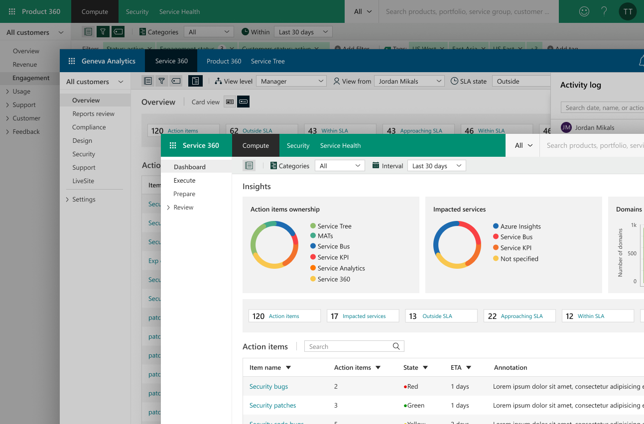
Overview
The problem worth solving
Microsoft's Cloud Engineering organization operates at enormous scale thousands of internal engineers, hundreds of partner organizations, and a sprawling portfolio of cloud services that must be monitored, managed, and continuously improved. The infrastructure for doing that work existed across four platforms: Service 360, Product 360, Service Tree, and Geneva Analytics. Each had been built and iterated independently, and the result was a fragmented, incoherent experience. The UI was chaotic patterns for filtering, navigation, status signaling, and data tables were implemented differently in every tool. Users moving between products had to relearn the interface every time.
The 360 platforms were the highest-priority surfaces. Service 360's dashboards surfaced numbers but not meaning. Product 360 had an additional problem: it wasn't used by engineers alone. It pushed security reports and required action items to compliance officers, business leads, and partner stakeholders who had no engineering context people who needed to act on findings but couldn't interpret raw telemetry. The UI served neither audience well.
I was brought in not to build from scratch, but to do something harder: redesign a deeply embedded suite of tools standardizing patterns across all four products, and rebuilding the 360 experiences to serve both technical and non-technical audiences without compromise.
Key Contributions
- Redesigned Service 360 around a 'five-second clarity' principle service health, regional status, and SLA compliance immediately visible on landing
- Rebuilt Product 360 to serve two audiences simultaneously: engineers needing full operational depth, and non-engineers receiving security alerts and action items who needed to act without technical context
- Led IA workshops across engineering, PM, partner, and compliance stakeholders to align on role-based information hierarchy across both platforms
- Conducted a cross-suite UI audit across Service 360, Product 360, Service Tree, and Geneva Analytics identified and resolved critical interaction inconsistencies
- Extended Microsoft's Fluent Design System with a unified pattern set adopted across all four tools: one filter system, one table behavior, one status hierarchy
- Drove internal user adoption from baseline to +60% through redesign and continuous post-launch refinement across the 360 platforms
Role
Senior UX Designer
Company
Microsoft
Year
2018
Platforms
Service 360, Product 360,
Service Tree, Geneva Analytics
Team
Cloud Engineering PM,
Engineering, Partner Programs
Design System
Fluent Design System
Tools
Sketch, PowerBI, DevOps
The 360° Concept
One view. Every signal that matters.
The Cloud Engineering Service Suite is a standalone family of four Microsoft-internal platforms Service 360, Product 360, Service Tree, and Geneva Analytics. Each had grown independently with no shared design language. The redesign had to establish coherence across all four while bringing focused clarity to the two highest-friction surfaces: the 360 platforms.
Service 360
Real-time operational health across the Cloud Engineering service portfolio
Service 360 gives Cloud Engineering teams a unified operational picture of every service across the portfolio live status, SLA compliance, incident history, and regional health in a single, navigable surface. It's the ops room for Cloud Engineering's entire service landscape.
Design Goal
"Is my service healthy, and if not where and why?" Answered in five seconds.
Product 360
Partner adoption intelligence and product health for engineers and non-engineers alike
Product 360 served a wider audience than its technical exterior suggested. Engineers used it daily as an operational intelligence tool but it also pushed security reports, compliance alerts, and required action items to partner stakeholders, compliance officers, and business leads who were not technical. The UI had grown chaotic through years of independent iteration, with no standardized patterns for how information was organized, filtered, or surfaced.
Design Goal
Usable by the engineer and the compliance officer the same data, at the right level of depth for each.
Service Tree
The authoritative catalog of every Cloud Engineering service ownership, dependencies, and lifecycle metadata in one place
Service Tree is the canonical source of truth for Cloud Engineering's service portfolio. Engineers register services, define ownership, document dependencies, and track lifecycle status. It's the backbone that every other tool in the suite references and it had no coherent information architecture. Finding a service, understanding its owner, or tracing its dependency chain required tribal knowledge the platform should have made obvious.
Design Goal
Make finding, understanding, and managing a service feel like looking something up not navigating a maze.
Geneva Analytics
Ad-hoc querying and data visualization for Cloud Engineering's operational telemetry and metrics
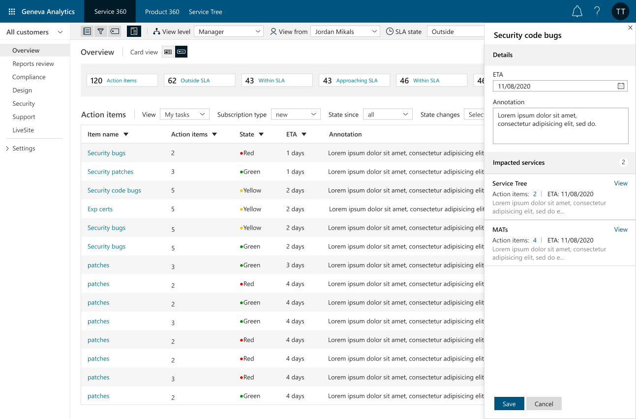
Geneva Analytics is where engineers go when the dashboards aren't enough to write ad-hoc queries, explore raw telemetry, visualize trends, and build custom views from Cloud Engineering's data layer. The existing experience was raw and unforgiving: a query interface that assumed deep expertise and offered no scaffolding for engineers who needed answers without being data specialists.
Design Goal
Lower the floor without raising the ceiling make data exploration accessible to all engineers, not just specialists.
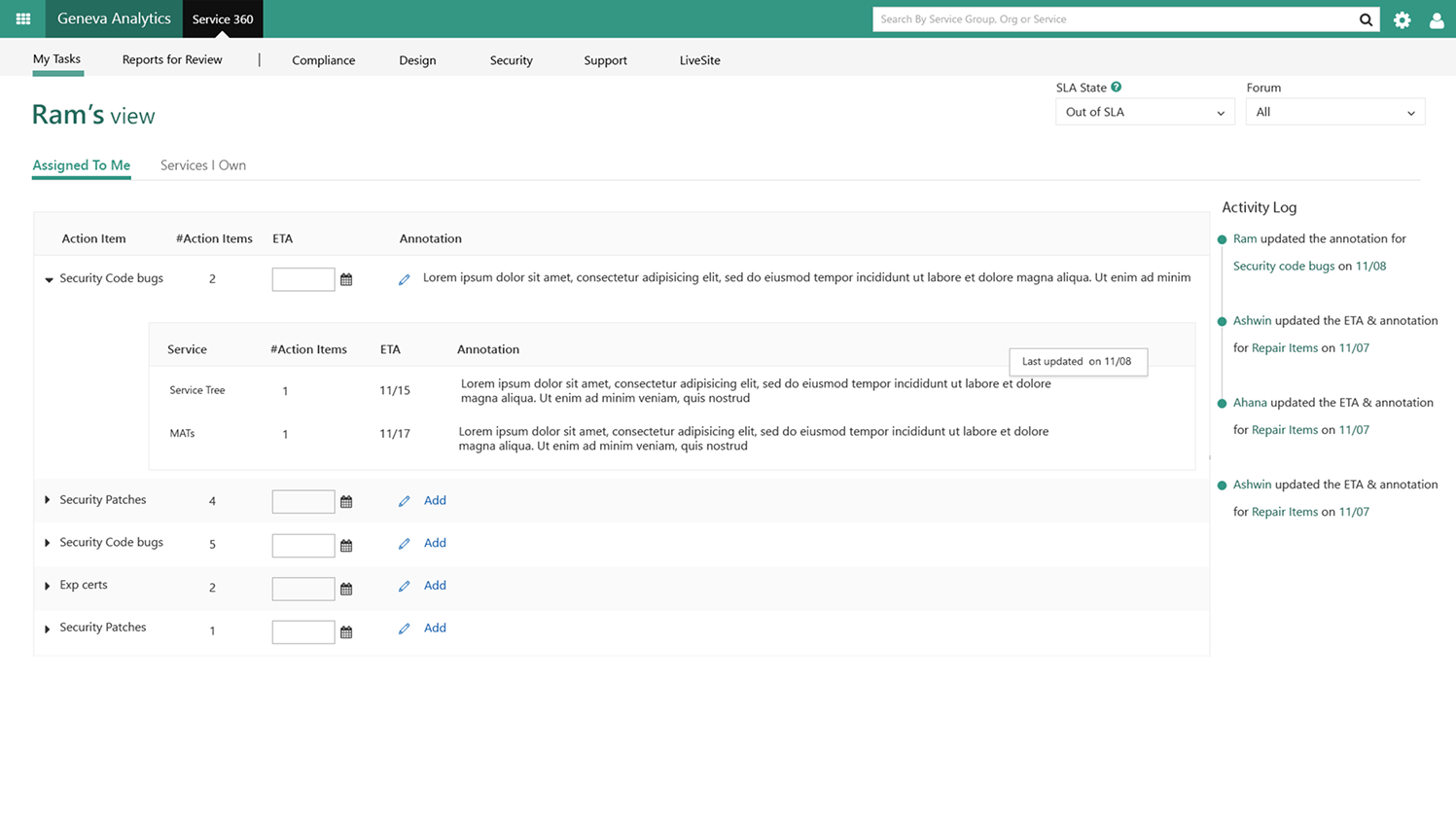
Original Geneva Analytics experience before the redesign
Redesign of Geneva Analytics with clearer hierarchy and context
The Core Design Challenge
Data ≠ Clarity
Both platforms had plenty of data. What they lacked was hierarchy a principled decision about what to show first, in what form, for whom. The redesign treated information architecture as the primary design problem, not a secondary concern.
Engineers & Non-Engineers, One Surface
Product 360 sent security alerts and action items to compliance officers and business leads people with no engineering context. The redesign had to serve both: technically rigorous enough for engineers, clear enough that a non-engineer could open a security action item and immediately know what to do.
No Shared Pattern Language
Across all four tools in the suite Service 360, Product 360, Service Tree, and Geneva Analytics every interaction pattern had drifted. Filtering, table behavior, status signaling, navigation: each product did it differently. Users had to relearn the interface every time they switched tools. The redesign established a unified pattern set across the entire suite.
Design Process
How we got there
Context & Stakeholder Immersion
I joined the project mid-stream the Cloud Engineering Service Suite already existed as a family of four tools: Service 360, Product 360, Service Tree, and Geneva Analytics. Each had grown independently, and it showed. There was no standardized UI language not within individual products, and certainly not across the suite. Patterns for filtering, navigation, data tables, and status signaling were implemented differently in every tool. My first step was deep stakeholder immersion: interviews with Cloud Engineering leads, partner program managers, engineers, and critically, the non-engineering business stakeholders who also received reports and security action items out of Product 360. The core finding was consistent across every conversation users had the data, but no meaningful way to interpret it in context. The UI was chaotic, filtering was buried, and there was no trust in the interface because nothing behaved the way you expected it to.
Defining the 360° Experience
Service 360 and Product 360 are built on the principle of a full-circle operational view every signal about a service or product surfaced in one place, for every stakeholder who needs it. But the audience for Product 360 in particular was far wider than 'engineers.' The platform sent out reports and security action items to individuals across the ecosystem who were not technical program managers, compliance officers, business leads people who needed to act on findings but had no engineering context to lean on. The design challenge was making the same surface readable and actionable for both audiences simultaneously: technically rigorous enough to earn engineers' trust, clear enough that a non-engineer could open a security action item and immediately know what to do. I facilitated IA workshops to align on what 'complete' meant for every role what data, in what form, at what level of technical depth.
Service 360 Service Health at a Glance
Service 360 needed to answer one question in five seconds: is my service healthy, and if not, where and why? I redesigned the primary dashboard to lead with a real-time service health summary status across regions, incident history, and SLA compliance before surfacing the deeper telemetry layers. Navigation was restructured around service lifecycle stages rather than data categories, so engineers could follow the natural arc of a service's operational story. Component-level drill-downs let teams move from aggregate status to root-cause context without losing their place in the broader picture.
Product 360 Engineered for Everyone
Product 360's audience problem was its defining design challenge. Engineers used it daily as an operational tool. But it also pushed reports and security action items vulnerabilities, compliance gaps, required remediations to individuals across the partner ecosystem who were not engineers. A compliance officer or business lead receiving a security alert shouldn't need to understand telemetry to act on it. I rebuilt the core experience around two parallel reading modes: a dense, data-rich view for technical users who needed the full picture, and a clear, action-forward view for non-engineers who needed to know one thing 'what do I need to do, and by when?' Alongside this, I standardized the UI patterns that had grown chaotic through independent iteration: consistent filter behavior, predictable table interactions, a unified status language, and a notification and action-item system that felt coherent whether you were an engineer or not.
Standardizing Across the Suite Fluent as Glue
One of the highest-leverage problems wasn't inside any single platform it was the absence of consistency across all four tools in the suite. Service 360, Product 360, Service Tree, and Geneva Analytics each had their own patterns for the same interactions: sorting a table, applying a filter, reading a status badge, navigating between views. A user moving between tools had to relearn the interface every time. The redesign treated Fluent Design System not just as a visual framework, but as the standardization layer across the entire suite. I mapped the divergent patterns across all four products, identified the critical inconsistencies causing the most friction, and designed a unified pattern set one filter system, one table behavior, one status hierarchy, one navigation model implemented through shared Fluent-based components that each product could adopt.
Validation, Handoff & Adoption
Ran moderated usability studies with engineering managers and partner program leads across both platforms, using task-completion benchmarks tied to the core 'five-second clarity' goal. Iterated on navigation labels, filter placement, and data hierarchy based on findings before final handoff. Worked closely with engineering teams through implementation maintaining design fidelity through review cycles and edge-case refinement. Post-launch, internal adoption climbed 60%, measured by active weekly users across both 360 platforms and validated by partner team feedback collected through the Cloud Engineering program.

Design System
Fluent as a foundation,
not a ceiling
All four tools in the Cloud Engineering Service Suite Service 360, Product 360, Service Tree, and Geneva Analytics live within the same Microsoft Cloud Engineering shell, making Fluent Design System compliance a non-negotiable starting point. But Fluent's standard component library wasn't built for the complexity of operational intelligence, service cataloging, and ad-hoc data querying at this scale.
The deeper challenge was cross-suite standardization. Each product had extended or ignored Fluent in its own way, creating drift that made switching between tools disorienting. I mapped every divergent interaction pattern across all four products and designed a unified pattern set: Fluent as the foundation, purpose-built operational patterns layered on top, shared across the whole suite.
Multi-level filter systems
One consistent cascading filter pattern region, tier, product, time range implemented identically across all four tools
Status badge hierarchies
A suite-wide four-tier severity system (healthy / warning / degraded / critical) with consistent accessible color and icon pairings
Contextual action menus
Inline recommended actions and security alerts surfaced alongside data not buried in a separate settings flow
Complex data table patterns
Sortable, filterable tables with expandable drill-downs standardized so the same interaction works identically in Service 360, Service Tree, and Geneva Analytics
Outcomes
Impact across the platform
+60%
Internal adoption
Active weekly users across both 360 platforms climbed 60% post-redesign driven by clarity improvements that made the tools genuinely useful for the engineering and partner management workflows they were built for.
4 products
Unified under one pattern language
Service 360, Product 360, Service Tree, and Geneva Analytics four independently built tools aligned to a single interaction pattern set for the first time. One filter system, one table behavior, one status hierarchy across the entire suite.
8+
Partner teams enabled
Cloud Engineering partner teams gained meaningful adoption intelligence through Product 360 with filterable funnel views, security action routing, and gap analysis that made the partner program's health visible at a glance.
5 sec
Time-to-clarity goal achieved
The 'five-second clarity' benchmark can an engineer immediately understand their service's health on landing? validated through usability testing on Service 360 and confirmed with task-completion telemetry post-launch.
Reflection
What this project taught me
Redesigning an existing, embedded enterprise suite is a fundamentally different problem than building from scratch. The constraint isn't a blank canvas it's trust. The engineers and partner managers who depended on all four tools Service 360, Product 360, Service Tree, and Geneva Analytics had already built mental models around the existing interfaces, even broken ones. Earning the right to change those models required immersion first, solutions second.
The cross-suite audit was the work that unlocked everything else. Until you lay out every filter pattern, every table behavior, every status badge from all four products side by side, the scale of the drift is invisible. Making it visible and bringing the right stakeholders into the room to see it created the alignment that made a shared pattern language possible. The Fluent extensions followed naturally from that shared understanding.
The dual-audience problem in Product 360 sharpened my thinking about what "usability" actually means in an enterprise context. An engineer and a compliance officer can look at the same security alert and need completely different things from it. Designing for both without creating two separate products through progressive disclosure, smart defaults, and context-aware hierarchy is the kind of invisible design work that never shows up in a screenshot, but is exactly what makes the difference between a tool people tolerate and one they trust.
Terance is a hybrid, a true living unicorn that is very very rare to find. I have known him since my time at Microsoft. He not only worked on creating the experiences for Service Tree and Geneva Analytics, he was also responsible for a lot of Azure's internal branding. He worked on influencing the details of the new Fluent library we see today.
Vince Kodikal
Product Design Specialist, Boeing Space Intelligence and Weapons · formerly Microsoft
Explore more work
See all projects